I've mentioned
before about the challenges I've had coming up with a logo. Now that I've settled on one (I hope), I'm starting to go through all the headers, avatars and related stationery to try to get everything as similar as possible... all part of a
branding strategy I'm trying to incorporate into my business.
I've got a new header on my
Etsy store, a new background for my
Twitter page, I'm working a new banner for this blog - along with a new placeholder design (placeholder because I do own
nisseworks.com, just don't have the funds to actually have the site hosted yet)... and then there's the business cards.
Like I said, logo's no problem. I like my logo - a nice combination of fonts and a nifty use of a brush shape in
Illustrator (I'm still using CS4... CS5 is a very, very, VERY distant purchase)... it's how I'm going to use it to effectively sell my brand that's the problem.
This was the very first business card I did up, back when I thought I could actually be a freelance graphic designer in a city that has an odd plethora of freelance graphic designers. Ignoring the logo, it's not terrible. Simple, clean, easy to recognize... because it's pretty damn bland. Looking back (six months), I can't believe I thought this was how I wanted my potential business portrayed - especially as a graphic designer. Eep.
The second go-around. An improvement, if only because it wasn't so
bleh as the first one. This is the card that I came up with when I launched nisse.works as a handmade crafts enterprise (hence the tag 'Handmade crafts & designs... smart, eh?). If there's one thing I've learned in my many years in graphic design and journalism, it's that sometimes, less is more. I liked this card, but because I'm trying to keep expenses to a minimum, I print my cards at home (on my lovely
Epson that I picked up on sale and don't use enough). And because I'm not a major print shop, those thin pink, green and brown stripes on the left side don't always turn out right. Or at all.
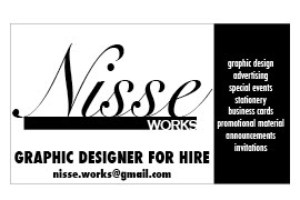
This is the most recent version of my business cards. Even simpler than the previous one, but not as mundane as the first. It's got the info I want right where I want it (I'm a fan of justification - left, centre, right... I don't care, as long as it's all justified) and looks pretty damn good on the metallic cardstock I've got. But as with most things I design for myself, I'm not as keen on it today as when I came up with it, so this whole branding thing couldn't have come at a better time.
I have no idea what the next round of cards will look like - I will be doing them myself and printing them from home to save on the costs, so there's no need to use the local big box office supply store's standard offerings. Simplicity, yet creative and unique are definitely going to have to play a part, but I don't want them to look like someone made them up in Microsoft Paint. I shudder at the thought...
I've collected a few websites that have some pretty kickass samples of business cards that I can hope to one day emulate (not duplicate). Take a look through them and marvel at how awesome - for lack of a better word (it is after 10pm here, so...) - these cards look. Especially when you consider the old standby design of 'logo in the left corner, name and title centred, bolded and in 12pt Times New Roman, office address and information below that in 8 pt TNR as well'. Blah.
100 Fresh Creative Business Cards
100 Refreshing Black & White Business Cards
The Basics of Business Card Design
Business Cards - a set on Flickr
Cool Business Cards


No comments:
Post a Comment
Speak up